Still Not Seeing The Right Packaging Solution? Talk to Our Boss.
If you’ve reviewed our website or spoken with sales and still don’t see a clear path, send your request here. Your message goes directly to our General Manager for an executive review of feasibility, cost, and lead time. You’ll get a clear next step—what we can do, what we need from you, and the fastest route to a quote.
Built for packaging managers, procurement, and packaging engineers. Specify size, quantity, and finish to receive moq, lead time, and spec guidance for us/eu programs.
Quote-ready customization: diameter, height, wall thickness, inserts, liners, and closures
Paper Tube Packaging Design: 7 Ideas for Better Unboxing & Branding
Good paper tube packaging design does more than make a cylindrical box attractive. It controls how the package feels in the hand, how the lid opens, how the product is revealed, whether the contents move during transport, how the graphics read around a curved surface, and whether the design can be reproduced consistently in bulk production.
For B2B buyers, that means unboxing and branding should not be treated as decoration added after the structure is finished. They should be designed into the tube from the beginning.
Key Takeaways
The opening experience depends heavily on fit, overlap, friction and dimensional consistency, not simply graphics.
Use the cylindrical format intentionally: artwork must account for the full circumference, seam, lid orientation and product-facing position.
Inserts are both protective components and presentation components; an expensive exterior loses impact if the product rattles or sits off-center.
Kraft paper, specialty wraps, foil and coatings communicate different brand positions, but sustainability claims should remain specific and supportable.
QR codes are useful when they extend instructions, authentication, disposal information or brand content—not when they merely send users to a homepage.
Validate the decorated physical package under production and distribution conditions before committing to a large run.
What Makes Paper Tube Packaging Different to Design?
Paper tube packaging combines a rigid cylindrical body with one of several closure systems, such as a lift-off lid, telescoping outer lid, shoulder-neck construction or separate end cap. That gives designers a different set of opportunities—and constraints—than conventional folding cartons.
A cylinder has no obvious front panel until the brand creates one. Consumers can rotate it. The opening often involves a sliding motion instead of lifting a carton flap. Lid fit can therefore become part of the perceived quality of the package.
From a production perspective, the designer also has to consider:
finished internal and external diameter;
lid-to-body clearance;
lid overlap depth;
tube seam position;
wrap-paper seam position;
artwork orientation;
board and wrap thickness;
rolled edges;
insert dimensions;
primary-product clearance;
surface durability;
carton packing and shipping.
This is why the most effective tube concepts begin with the actual product and use case—not with an Illustrator template.
1. Engineer the Opening Sequence Before Choosing the Finishes
A satisfying unboxing experience starts with controlled movement.
For a telescopic tube, the lid should stay secure during handling but release without the customer fighting the package. If the fit is too loose, the tube can feel imprecise or separate unintentionally. If it is too tight, opening becomes frustrating and may scuff the surface.
A useful design brief should therefore define the intended interaction:
Does the customer pull the lid vertically or twist slightly?
How much of the inner neck should be visible before opening?
Should there be a strong color reveal underneath the lid?
Does the product appear immediately, or should an insert create another reveal step?
Can the customer remove the product comfortably without turning the package upside down?
A telescopic paper tube for electronics provides a useful structural example. Its outer purple component slides over a contrasting white inner section, creating both a friction-fit closure and a visual transition during opening.
A natural kraft telescoping gift tube uses the same basic principle with a raised inner neck and restrained kraft presentation. The opening mechanism is similar, but the brand message is completely different.
Design the sound and friction indirectly
You do not need to manufacture an artificial sound effect. Dimensional fit, overlap, paper friction and trapped air already influence how a tube opens.
The correct target is consistent functional feel, not the tightest possible lid.
This is also why a single handmade sample should not be the only approval criterion. Bulk production must hold the fit closely enough that the opening behavior remains acceptable from one batch to another.
2. Use Material and Texture as Part of the Brand Language
Material selection communicates before the consumer reads a word.
Natural kraft, smooth coated paper, black specialty stock and textured wraps create very different expectations. The correct choice depends on what the brand wants the package to communicate.
Material Direction
Brand Impression
Works Well For
Watch For
Natural kraft
Organic, restrained, craft-led
Bath/body, tea, candles, natural products
Color variation and limited bright-print reproduction
White coated wrap
Clean, graphic, versatile
Cosmetics, supplements, retail products
Scuffing and surface protection
Black specialty paper
Premium, dramatic, minimalist
Fragrance, spirits, gifts
Dust, fingerprints, rub marks
Textured specialty paper
Tactile, artisanal, premium
Gifting, fragrance, jewelry
Print/foil interaction with surface texture
Matte laminated print
Controlled, contemporary
Broad premium applications
Added material complexity
A kraft bath bomb tube shows how natural kraft, simple white branding and a contrasting white interior can create a coherent bath-and-body identity without requiring a long list of decorative processes.
Do not confuse a kraft appearance with a complete sustainability strategy
Paper-based presentation can support a lower-material-complexity design, but terms such as “green” or “eco-friendly” are not useful purchasing specifications by themselves.
The U.S. Federal Trade Commission advises marketers against broad, unqualified general environmental benefit claims and calls for specific qualification and substantiation.
For sourcing, replace vague requirements with questions such as:
Is recycled fiber required?
What percentage and type of recycled content is specified?
Is FSC-certified material required?
Does the relevant supplier hold appropriate Chain-of-Custody certification?
Is lamination actually necessary?
Can an insert be paperboard or molded fiber rather than foam?
Are mixed-material components easy to separate?
What recycling claim can legitimately be made in the target market?
FSC explains that Chain-of-Custody certification verifies eligible forest-based materials as they move through the supply chain and enables qualifying organizations to label finished FSC-certified products.
The point is not to make the package look sustainable. The point is to specify what sustainability means for the project.
3. Design the Artwork for 360 Degrees, Not Like a Flat Carton
One of the strongest visual advantages of a paper tube is also a common design mistake: there is no fixed rectangular front panel.
A cylindrical package rotates in the hand, so the artwork should function as a continuous system.
Before final artwork, identify:
the primary consumer-facing area;
the vertical wrap seam;
the tube-body seam if relevant;
barcode position;
regulatory copy area;
lid artwork orientation;
registration between lid and body if needed;
areas where foil or embossing approach a rolled edge;
where the design begins and ends around the circumference.
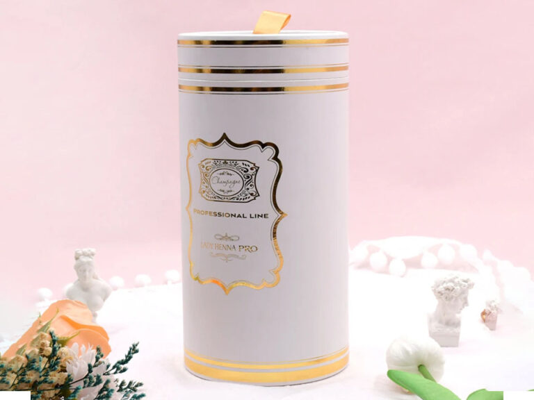
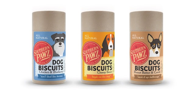
A full-wrap printed paper tube illustrates the opportunity. The long cylindrical body uses detailed graphics across the exterior rather than treating the package as a conventional front-and-back box.
Three useful cylindrical artwork approaches
Continuous narrative
Use illustration, landscape, pattern or typography that wraps intentionally around the tube. This rewards rotation rather than hiding information on a “back.”
Strong front with restrained remainder
Create a clear hero area for ecommerce photography and shelf presentation, then keep the remaining circumference quieter for supporting information.
Component contrast
Use different but coordinated treatments on the lid, body, inner neck or base. This can create more visual depth without adding another packaging component.
The artwork file should still account for manufacturing reality. Fine lines crossing the wrap seam, critical typography close to rolled edges, or artwork that depends on perfect lid-to-body rotational alignment can create unnecessary QC problems.
4. Make the Product Reveal Part of the Structural Design
A premium tube does not feel premium if the customer opens it and finds the product leaning against the wall.
The insert determines:
whether the product stays centered;
whether it rattles;
whether fragile surfaces contact the tube;
how easily the product can be removed;
what the consumer sees immediately after opening.
Common choices include:
Insert
Advantages
Limitations
Die-cut paperboard
Lightweight, printable, paper-dominant construction
Limited cushioning for fragile products
Folded paper cradle
Efficient and customizable
Requires accurate structural design
Molded fiber
Formed product cavities and fiber-based appearance
Tooling and surface detail require consideration
EVA/EPE-style foam
Strong cushioning and precise retention
Adds a separate material to the pack
No insert
Lowest component count
Suitable only when product movement is acceptable
A black perfume tube with foil branding combines a matte-black exterior, gold foil and a fitted paperboard bottle holder. The insert is important because it controls the position of the fragrance bottle after the lid is removed; the product reveal is therefore structural, not just graphic.
Start from the actual product
Do not approve an insert around nominal dimensions alone when the primary package is already available.
Check:
widest product diameter;
closure diameter;
base geometry;
pumps or droppers;
protrusions;
fragile decoration;
center of gravity;
removal method.
The goal is not maximum tightness. The goal is adequate retention with practical assembly and removal.
5. Use Contrast and Finishing Selectively
A common premium-packaging mistake is assuming that more finishing processes create more perceived value.
They do not necessarily.
Foil stamping, embossing, debossing, spot UV, matte lamination, specialty paper and metallic stock each have a role. Combining all of them can produce a busy package, increase setup requirements, introduce more production checkpoints and complicate recycling claims.
A stronger approach is to establish a decoration hierarchy.
For example:
matte black paper + one gold foil mark;
natural kraft + one-color printing;
white printed wrap + blind emboss;
solid-color exterior + contrasting inner neck;
detailed full-wrap print + plain end caps.
The black fragrance-tube example works because the foil is used as controlled contrast rather than as the entire design.
Premium finishing cannot compensate for poor engineering
Before spending budget on decorative upgrades, validate:
lid fit;
product retention;
tube roundness;
seam alignment;
edge quality;
surface rubbing;
artwork placement;
assembly method.
A tube that opens badly but carries expensive foil is still a badly designed tube.
6. Extend the Package Digitally Without Crowding the Artwork
A QR code can give a relatively small paper tube access to far more information than will comfortably fit on its printed surface.
Useful destinations include:
installation or setup instructions;
product tutorials;
ingredient or material information;
multilingual instructions;
authenticity verification;
disposal guidance;
warranty registration;
product-specific documentation;
refill or reorder information.
GS1 describes QR Codes using GS1 Digital Link as a gateway from physical packaging to online information such as ingredients, sustainability details and usage instructions; the same framework can also carry standardized product identifiers and related data.
That is more valuable than printing a QR code simply because “smart packaging” is fashionable.
Treat the destination as part of the packaging specification
A printed tube may remain in homes, warehouses and retail channels long after a campaign ends. Avoid linking permanently printed codes to disposable campaign URLs.
Specify:
who owns the destination domain;
who can change redirects;
what happens if content moves;
whether localization is required;
whether batch-specific information is necessary;
code contrast and print quality;
placement away from seams and highly reflective finishes.
GS1 also notes that a persistent Digital Link URI can be redirected to updated content without changing the physical QR symbol, which is useful for packaging that has a longer lifecycle than the webpage behind it.
7. Design the Tube for Production, Shipping and Repeat Orders
This is the design step that many inspirational packaging articles omit.
A tube is not successful because the approved prototype looks good. It is successful when thousands of production units remain within agreed functional and visual limits and arrive at the customer in acceptable condition.
Build a production specification
Record at minimum:
internal and external dimensions;
acceptable dimensional tolerance;
board construction;
outer wrap specification;
lid and base configuration;
insert material and geometry;
color references;
approved printing process;
foil reference;
finish or coating;
seam position;
opening/closing acceptance;
appearance defect criteria;
carton quantity;
protective packing method;
approved master sample.
Test the assembled product, not an empty tube
Distribution testing should reflect the real packaged product and intended route.
ISTA’s 3-Series protocols are designed to simulate distribution hazards such as vibration, drop events and environmental conditions. Procedure 3A, for example, is intended for individual packaged products moving through parcel-delivery systems.
The test plan should be selected according to the actual distribution environment rather than attaching “ISTA tested” generically to a packaging specification.
Right-size the structure
For brands selling into Europe, packaging efficiency is becoming a regulatory design issue as well as a freight issue.
The EU Packaging and Packaging Waste Regulation has applied since August 12, 2026. Article 10 requires manufacturers or importers, by January 1, 2030, to design packaging so its weight and volume are reduced to the minimum necessary for functionality and restricts features intended merely to increase apparent product volume, subject to specified exceptions.
That does not mean premium tubes must become visually plain. It means premium presentation should come from deliberate structure, graphics, touch and reveal—not gratuitous empty volume.
Which Paper Tube Design Direction Fits Your Product?
Design Direction
Best For
Structural Priority
Branding Opportunity
Main Risk
Telescopic tube
Gifts, electronics, beauty, accessories
Consistent friction fit
Contrasting inner reveal
Lid too tight or loose
Shoulder-neck tube
Fragrance, candles, premium gifts
Neck alignment and cap fit
Multi-level color/finish
Extra component complexity
Kraft tube
Natural, craft and wellness positioning
Clean edges and print control
Material becomes visual identity
Overstated sustainability claims
Full-wrap printed tube
Illustration-led brands and elongated products
Seam positioning
360° storytelling
Artwork collision at seam
Tube with fitted insert
Fragile bottles and premium products
Product retention
Controlled reveal
Excessive or unsuitable insert material
What Should a B2B Buyer Include in a Paper Tube Design Brief?
A useful RFQ should tell the supplier enough to evaluate both appearance and manufacturability.
Include:
product type;
product dimensions and weight;
photographs or drawings of the item;
target tube diameter and height if known;
preferred structure;
quantity per SKU;
number of artwork variations;
destination market;
printing requirements;
Pantone colors where needed;
foil, embossing or coating requirements;
insert requirements;
sustainability requirements;
certification requirements;
barcode/QR requirements;
shipping route;
required testing;
launch date.
Ask the supplier to identify which requirements drive tooling, setup cost, MOQ or lead time.
This matters because the cheapest piece price does not automatically produce the lowest-risk sourcing decision. At low or uncertain volumes, a standard or semi-custom structure with customized printing may be commercially smarter than committing immediately to a highly specialized tube.
Common Paper Tube Packaging Design Mistakes
Designing around the artwork instead of the product
The physical product determines the internal geometry. Artwork comes later.
Assuming a digital mockup proves fit
A 3D rendering can validate proportions and graphics. It cannot validate lid friction, product movement, tactile coating, scuffing or mass-production tolerances.
Adding every premium finish
Select finishes that support the brand concept. Each additional process should justify its cost and production complexity.
Ignoring the seam
The cylindrical surface still has manufacturing transitions. Critical text and design features need appropriate placement.
Calling any paper tube “eco-friendly”
Material composition, coatings, inserts, closures, recycled content, sourcing and local recycling systems all affect what claims can reasonably be made.
Buying too much packaging to reduce unit price
MOQ optimization and total-cost optimization are not the same thing. Excess packaging inventory becomes expensive if the SKU, artwork, labeling rules or product dimensions change.
Frequently Asked Questions
What is the best structure for premium paper tube packaging?
For many premium products, telescopic and shoulder-neck tubes work well because their multi-part construction creates a deliberate opening sequence and allows contrasting materials or colors. The correct structure still depends on product dimensions, weight, protection requirements, presentation goals and manufacturing budget.
How can a paper tube create a better unboxing experience?
Control the sequence of interaction: exterior appearance, grip, lid resistance, inner reveal, product position and removal. A fitted insert, clean interior contrast and predictable opening action usually contribute more to the experience than adding multiple decorative processes.
What printing and finishing options work on custom paper tubes?
Common choices include CMYK or spot-color printing, matte or gloss surfaces, foil stamping, embossing, debossing, spot UV and specialty paper wraps. The best combination depends on the substrate, artwork, desired durability, budget and environmental requirements.
Are kraft paper tubes automatically more sustainable?
No. Kraft appearance alone does not establish the environmental performance of the complete package. Buyers should evaluate fiber sourcing, recycled content, coatings, adhesives, inserts, closures, right-sizing, material separability and the recycling infrastructure of the intended market.
Do paper tubes need inserts?
Not always. Inserts are useful when the product must remain centered, protected or presented in a controlled position. Lightweight or closely fitted products may not require one. The insert should solve an actual retention or presentation problem rather than being added automatically.
Should I approve a physical sample before bulk production?
Yes for highly customized or higher-risk projects. A physical sample allows the team to evaluate fit, lid action, product retention, print, foil, surface feel and overall presentation. For significant runs, the approved sample should be accompanied by documented specifications and QC acceptance criteria.
The strongest paper tube packaging designs are rarely the ones with the longest list of finishes. They are the ones where structure, fit, materials, artwork and manufacturing all support the same idea.
Design the opening behavior first. Control the product reveal. Use the cylindrical surface intentionally. Add only the materials and finishes that serve a clear purpose. Then prove that the result can survive production and distribution.
That is how an attractive paper tube becomes packaging that a brand can actually scale.