Still Not Seeing The Right Packaging Solution? Talk to Our Boss.
If you’ve reviewed our website or spoken with sales and still don’t see a clear path, send your request here. Your message goes directly to our General Manager for an executive review of feasibility, cost, and lead time. You’ll get a clear next step—what we can do, what we need from you, and the fastest route to a quote.
Built for packaging managers, procurement, and packaging engineers. Specify size, quantity, and finish to receive moq, lead time, and spec guidance for us/eu programs.
Quote-ready customization: diameter, height, wall thickness, inserts, liners, and closures
How Paper Tube Packaging Design Shapes Consumer Perception
Paper tube packaging influences consumer perception before the customer has used the product inside. The cylinder’s shape, weight, material, color, surface texture, opening resistance, printing, insert fit, and environmental claims all provide cues that consumers use to form expectations about quality, sustainability, authenticity, and price positioning.
For brands, the practical lesson is not to add more decorative effects. It is to make sure the structural, visual, tactile, and verbal cues support the same positioning.
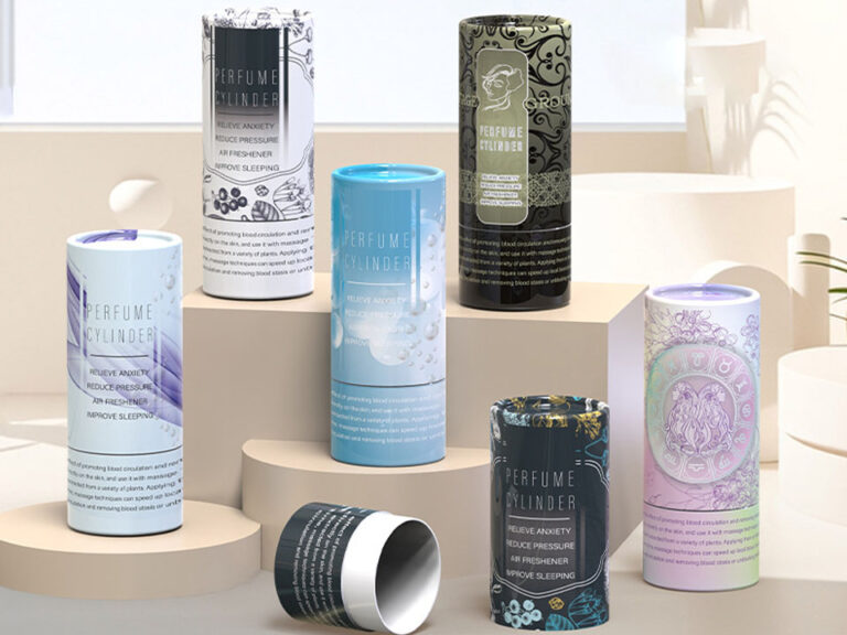
A kraft coffee tube, matte-black candle package, and foil-stamped skincare tube can all use essentially the same packaging category while creating very different expectations.
Key Takeaways
Consumers interpret packaging through multiple interacting cues, including material, shape, color, graphics, typography, and texture.
Structural quality—lid fit, tube rigidity, insert retention, and alignment—can reinforce or contradict a premium visual design.
Matte surfaces, specialty paper, embossing, and foil can influence perceived quality, but more decoration does not automatically mean more prestige.
Natural kraft and earthy graphics can signal sustainability, but appearance is not evidence of environmental performance.
Distinctive design needs enough category familiarity that customers can still understand what type of product they are buying.
The best packaging brief translates desired perceptions such as “premium,” “natural,” or “clinical” into measurable materials, colors, finishes, structures, and QC criteria.
Packaging Works Through Cues, Not Psychology Tricks
Packaging does not control what consumers think. It provides cues from which people form expectations.
A major 2026 meta-analysis examined 1,213 effects reported across 280 studies and found that visual packaging characteristics—including color, shape, material, imagery, logo, and text—affect packaging perceptions and product-related inferences.
For paper tubes, these cues operate simultaneously.
Consider two identical cylindrical structures:
one wrapped in uncoated brown kraft paper with black typography;
one wrapped in matte black specialty paper with metallic gold foil.
The structural engineering may be almost identical, but the perceived product positioning will probably not be.
That is why packaging psychology should be treated as a design-system problem, not a checklist of isolated tricks.
1. Structure Creates Expectations Before Graphics Do
Paper tubes already possess a visual characteristic that distinguishes them from standard folding cartons: their cylindrical form.
The consumer rotates the package rather than viewing one fixed front panel. A telescopic lid creates a sliding opening motion. A shoulder-neck tube exposes an inner collar when opened. Thick rigid walls can make a small product feel more substantial.
These structural signals contribute to perception before foil, embossing, or printed artwork enters the discussion.
Opening behavior is part of perceived quality
A telescopic tube that opens with controlled resistance can feel deliberate. The same design can feel poorly made if:
the lid slides off too easily;
the components bind;
the cylinder is visibly oval;
rolled edges are damaged;
the lid does not sit level.
The goal is not maximum friction. It is repeatable, intentional opening behavior.
A shoulder-neck serum tube illustrates how structure can contribute to presentation. The burgundy outer tube reveals a contrasting peach-colored inner neck as the lid is removed, making the reveal itself part of the visual experience.
For a packaging engineer, that consumer-facing moment translates into practical variables:
finished diameter;
lid overlap;
collar height;
component clearance;
paper thickness;
friction range;
dimensional tolerance.
The emotional impression ultimately depends on physical manufacturing control.
2. Color and Material Set Product Expectations
Color is one of the most immediate packaging cues.
Research across packaging categories has repeatedly shown that color can influence expectations about products before consumption. A 2026 systematic review covering 55 experimental studies across 18 countries found consistent relationships between packaging color characteristics and food-related expectations, although the effects depend on product category and context.
That final qualification matters.
There is no universal formula such as:
black = luxurygreen = sustainableblue = trustworthy
Packaging meaning develops through the interaction of color, category conventions, materials, typography, brand identity, and consumer experience.
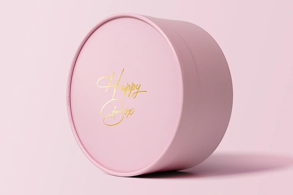
The gold detail is effective partly because it is used against a controlled matte field rather than competing with many other decorative elements.
Kraft and natural-material cues
The opposite design language appears in a printed kraft coffee tube. Natural brown paper, dark printed ornamentation, and a low-gloss surface can communicate craft, simplicity, naturalness, or traditional production.
The critical word is communicate.
The surface creates an impression. It does not by itself prove how sustainable the complete package is.
3. Touch Can Reinforce—or Undermine—Premium Perception
Paper tube packaging is unusually tactile because customers normally grip the cylinder with a relatively large contact area and physically manipulate the lid.
That makes surface texture important.
A study of 400 consumers examining cosmetic packaging found that tactile coatings influenced preference compared with untreated packaging. Both raised tactile treatments and soft-touch effects produced measurable preference differences, although the relationship between tactile treatment and willingness to pay was not identical for every coating.
For brands, the useful lesson is not “always use soft-touch.”
It is that touch communicates information.
Relevant surface choices include:
Surface Direction
Likely Design Impression
Procurement Consideration
Uncoated kraft
Natural, craft-led, restrained
Fiber variation and print density
Matte specialty paper
Refined, controlled
Scuffing and fingerprints
Soft-touch finish
Smooth, tactile, premium
Cost, abrasion and material complexity
Emboss/deboss
Crafted, dimensional
Registration and tooling
Metallic foil
Premium accent, contrast
Die cost, registration and rub resistance
Gloss detail
Energy or focal emphasis
Reflection and fingerprint visibility
A premium package therefore needs a finish hierarchy rather than a finish collection.
One strong tactile cue and one controlled visual accent can be more credible than foil, embossing, UV, lamination, texture, and metallic paper used simultaneously.
4. Product Fit Changes the Way Customers Judge Quality
Consumers may not know the term “insert tolerance,” but they notice the consequences.
A product that rattles inside the package can make a rigid tube feel less considered. An off-center bottle can weaken the reveal. A product that is difficult to remove creates friction at precisely the moment the brand wants to create satisfaction.
That makes inserts psychological and mechanical components.
A cosmetic paper tube with a fitted insert can use paperboard, foam, or EVA retention depending on the product geometry and protection requirement. The current live page is positioned around lip balm and similar small cosmetic tubes despite the older serum-oriented URL.
Select inserts according to function
Insert Type
Perception Benefit
Technical Benefit
Tradeoff
Die-cut paperboard
Clean, integrated presentation
Positions lightweight products
Limited cushioning
Folded paper cradle
Engineered, minimal appearance
Controls orientation
Requires accurate fit
Molded fiber
Natural, molded presentation
Supports irregular shapes
Tooling and texture
EVA/foam
Precision, protective appearance
Strong cushioning and retention
Additional material
No insert
Minimal, simple
Lowest component count
Product movement may be visible
Thicker cushioning is not automatically better.
The correct insert is the lightest, simplest construction that provides the required protection, alignment, and removal experience.
5. Sustainability Perception Is Powerful—but Easy to Misread
This is one of the most important areas where perception and reality can diverge.
Research published in the Journal of Cleaner Production found that packaging material and graphic appearance both influenced consumer sustainability perceptions. The study also found that consumers’ sustainability judgments could differ from environmental-impact assessments, meaning visual cues may lead people toward incorrect conclusions about which package actually performs better environmentally.
That creates a particular risk for paper tubes.
Natural brown paper, green graphics, leaves, recycling symbols, and minimalist printing can all create an environmentally responsible impression.
But the complete construction may still include:
plastic lamination;
foam inserts;
metallic components;
barrier films;
mixed-material closures;
adhesives;
coatings.
A set of natural kraft telescopic tubes shows how strongly material appearance alone can establish a natural visual direction even before custom printing is applied.
Do not turn visual perception into an unsupported claim
The FTC’s Green Guides caution marketers against broad, unqualified statements such as “green” and “eco-friendly” because consumers can interpret those statements as implying wide-ranging environmental benefits. The FTC recommends that environmental claims be specific and appropriately substantiated.
For a packaging specification, therefore, replace:
“eco-friendly paper tube”
with defined requirements such as:
FSC-certified paper required;
stated recycled-content requirement;
no plastic lamination;
paperboard insert preferred;
specific coating;
defined closure construction;
target-market recyclability review;
packaging right-sizing requirement.
The brand can still create a natural visual identity. The environmental claim simply needs to be based on the actual package rather than its appearance.
6. Distinctiveness Works Best When the Product Still Feels Familiar
Brands want packaging that looks different from competitors. Consumers still need enough familiar information to understand what they are seeing.
That creates a design tension:
category recognition versus brand distinctiveness.
If a skincare package abandons every category convention, the consumer may struggle to interpret it. If it copies all the familiar conventions, it becomes invisible.
Successful distinction usually changes a limited number of high-salience cues:
cylindrical rather than rectangular structure;
unusual but category-compatible color;
distinctive lid reveal;
unique illustration system;
controlled tactile finish;
recognizable typography;
a recurring foil or emboss element.
Build distinctiveness into a repeatable system
Novelty is more valuable when it can scale.
For a range of five candle scents, for example, procurement may keep:
one tube diameter;
one board specification;
one lid design;
one logo position;
one foil die;
while changing:
body color;
fragrance name;
illustration;
secondary typography.
The result can feel collectible to the consumer without creating five completely different manufacturing programs.
That matters because every additional diameter, insert, material, finish, and specialty component can introduce another MOQ, tooling requirement, approval step, and QC variable.
7. Brand Consistency Converts Packaging Cues Into Trust
Premium perception is not the same as decorative complexity.
Research into premium-package design has identified attributes including high-quality materials, differentiation, minimalistic design, and authenticity as relevant premium cues.
For a paper tube program, authenticity and consistency can be expressed through:
stable logo placement;
disciplined typography;
controlled color palette;
consistent interior treatment;
recognizable structure;
repeatable opening behavior;
accurate print registration;
consistent foil tone;
aligned product positioning.
A single attractive prototype does not create a brand system.
A brand system exists when the same design logic survives:
different SKUs;
different production batches;
different markets;
different product sizes;
ecommerce photography;
physical retail.
Production consistency is part of perception
Consumers do not see your approved Pantone specification or tolerance sheet. They see the finished package.
Color drift, loose lids, inconsistent foil, visible glue, scuffed wrapping, oval tubes, or off-center inserts all become brand cues whether the design team intended them to or not.
CPTB’s own manufacturing guidance identifies diameter control, seam alignment, lid friction, surface wear, decoration consistency, and final visual/functional inspection as relevant tube-production controls.
This is where brand management and QA stop being separate disciplines.
How Do You Translate a Desired Perception Into a Packaging Specification?
Avoid sending the supplier adjectives alone.
“Luxury,” “natural,” “clinical,” “young,” or “sustainable” are useful creative objectives but weak production specifications.
Fiber sourcing, recycled content, components and coatings
A Better Paper Tube Design Process
For brand, engineering, and sourcing teams, a practical development sequence is:
Define the desired consumer perception. Decide what the package should communicate: premium, natural, technical, craft, clinical, playful, or another clear position.
Confirm the product requirements. Measure the product, weight, fragility, closure, vulnerable surfaces, and orientation.
Select the structural system. Determine tube diameter, height, lid style, collar, base, and insert.
Establish the material language. Choose kraft, coated paper, specialty wrap, texture, and interior color.
Build the visual hierarchy. Set brand marks, colors, typography, information zones, barcode, and regulatory text.
Add only necessary finishes. Choose foil, embossing, coatings, or other treatments according to their role in the perception strategy.
Produce a physical sample. Evaluate appearance and the real consumer interaction.
Define QC acceptance criteria. Record what constitutes an acceptable production unit.
Approve against the real product. Do not evaluate an empty package if the final consumer will receive it with a bottle, jar, candle, or another item inside.
Common Packaging-Psychology Mistakes
Assuming black and gold automatically create luxury
They can create luxury associations, but poor fit, cheap-feeling surfaces, excessive graphics, or inconsistent production can contradict those signals.
Using kraft paper as proof of sustainability
Kraft is a visual and material choice. Assess the complete structure and substantiate environmental claims independently.
Adding tactile finishes without testing them
Touch matters, but finishes must also survive manufacturing, shipping, warehousing, and handling.
Creating novelty that cannot scale
A complicated prototype may work for an influencer kit but become expensive or inconsistent across tens of thousands of units.
Ignoring the product inside the tube
Packaging expectations create a promise. If the package communicates prestige but the product presentation feels loose, damaged, or badly aligned, that expectation can work against the brand.
Treating customer perception as separate from QC
Dimensions, print consistency, lid fit, scuffing, insert alignment, and foil registration all become consumer-facing brand signals.
Frequently Asked Questions
Does packaging design really affect how consumers perceive a product?
Yes. Research across many packaging categories shows that visual characteristics such as color, shape, material, imagery, logos, and typography influence package evaluation and product-related expectations. The strength and direction of those effects vary by product category, consumer, context, and the combination of cues used.
What makes paper tube packaging look premium?
Premium perception usually comes from coherent cues: rigid construction, controlled fit, appropriate materials, disciplined typography, consistent colors, precise printing, and selective finishing. Foil or embossing can reinforce that impression, but they cannot compensate for weak structural quality or inconsistent production.
Does matte packaging feel more premium than gloss packaging?
Not universally. Matte surfaces can support restrained or premium positioning, while gloss can create brightness, intensity, or strong visual contrast. The correct choice depends on the product category, brand identity, graphics, handling requirements, and other packaging cues.
Does kraft paper make consumers think packaging is sustainable?
Natural paper texture and related graphics can influence sustainability perception, but perception does not prove actual environmental performance. Research shows that consumers can misjudge environmental impacts based on packaging cues, so brands should substantiate environmental claims separately.
How important is touch in paper tube packaging?
Touch can be important because the customer normally grips the cylinder and manipulates the lid directly. Research on cosmetic packaging has shown that tactile coatings can affect consumer preference, although the commercial effect varies by coating and context.
Should brands prioritize packaging appearance or structural quality?
Structural quality should come first. The structure establishes product protection, opening behavior, alignment, and physical credibility. Once those requirements are stable, color, texture, graphics, foil, embossing, and other finishes can reinforce the desired perception.
Paper tube packaging influences perception most effectively when structure, material, color, texture, graphics, product fit, and claims communicate the same message.
A premium-looking surface attached to an inconsistent structure creates conflicting cues. Natural kraft combined with vague environmental promises risks overstating what the package actually delivers. Elaborate decoration without a coherent brand system creates visual noise rather than value.
For packaging buyers, that leads to a practical rule:
Define the perception you want, convert it into measurable packaging specifications, and then verify that those cues survive mass production.
That is where packaging psychology becomes useful packaging engineering.