Still Not Seeing The Right Packaging Solution? Talk to Our Boss.
If you’ve reviewed our website or spoken with sales and still don’t see a clear path, send your request here. Your message goes directly to our General Manager for an executive review of feasibility, cost, and lead time. You’ll get a clear next step—what we can do, what we need from you, and the fastest route to a quote.
Built for packaging managers, procurement, and packaging engineers. Specify size, quantity, and finish to receive moq, lead time, and spec guidance for us/eu programs.
Quote-ready customization: diameter, height, wall thickness, inserts, liners, and closures
Custom packaging design is the process of converting your brand identity and product requirements into packaging that can actually be manufactured consistently. For a B2B buyer, that means much more than deciding where the logo goes. The structure, dieline, artwork files, colors, printing method, finishes, barcodes, proofs and production specifications all have to work together.
A package can look excellent in a rendering and still fail in production. Logos can cross folds, colors can shift, foil can land too close to a cut edge, barcodes can become difficult to scan, and an insert that looked correct in CAD can allow the product to move during transit.
The practical objective is therefore not simply to design attractive packaging. It is to create a repeatable packaging specification that procurement, designers, printers and QC teams can reproduce across production runs.
Key Takeaways
Start custom packaging artwork only after the basic structure and production dieline are confirmed.
Supply vector logos and define critical brand colors using the printing system that will actually be used.
Choose digital, offset or another printing process according to SKU mix, quantity, substrate, color requirements and finishing—not according to a universal MOQ rule.
Treat a screen proof as an artwork check, not as a guarantee of exact production color.
Separate foil, embossing, spot UV, white ink and other special effects into clearly identified production layers.
For repeat orders, retain the approved artwork version, color reference, production sample and key specifications as part of the purchasing record.
What Does Custom Packaging Design Actually Include?
Custom packaging design combines structural design and graphic production artwork.
Structural design determines dimensions, wall construction, closure, insert, opening experience and how the product is held. Graphic design determines the logo, typography, colors, photography, regulatory copy and decorative graphics.
Printing and finishing connect those two disciplines to manufacturing.
For paper tubes, this means establishing variables such as diameter, height, lid structure, wrap material, insert and product fit before assuming that artwork can simply be scaled onto any cylinder. Buyers comparing formats can review different custom paper tube packaging options before committing to a particular structure.
A sound sequence is:
Define the product and distribution requirements.
Select the packaging structure.
Approve the manufacturing dieline.
Build artwork on that dieline.
Define print and finishing specifications.
Review proofs and prototypes.
Approve production.
Retain controlled references for reorders.
Reversing that sequence creates unnecessary redesign work.
Start With the Manufacturer’s Dieline, Not a Generic Template
A dieline is the production map showing how flat artwork relates to the manufactured package.
Depending on the structure, it can identify cut lines, folds, overlaps, glue areas, bleed, safe areas, openings and finishing positions. Adobe describes bleed as artwork extending outside the trim boundary to provide margin for the final trimming process. The exact bleed and safety specifications should still come from the packaging supplier because converting tolerances vary by structure and equipment.
This distinction becomes particularly important when a brand switches suppliers.
Two packages described by the same nominal dimensions may not use identical production tooling or construction. Moving artwork from one supplier’s template to another without checking the new dieline can move logos, text, seams or decorative features.
For projects requiring structural development rather than artwork placement alone, paper tube packaging design services can include structural engineering, custom inserts, dieline development and functional prototypes.
Do not confuse a dieline with the finished package
A flat file does not fully communicate:
lid overlap
visible seam location
curved-surface distortion
insert fit
opening resistance
paper texture
foil reflection
laminate feel
assembled panel orientation
For expensive launches or unusual structures, a physical prototype should therefore be part of the approval process.
How Should a Logo Be Designed for Custom Packaging?
The best logo treatment is usually the one that remains recognizable after printing, finishing, converting and assembly.
Use vector artwork for primary brand marks
Logos should normally be supplied as vector artwork rather than copied from a website or supplied only as a small JPEG.
Vector graphics retain clean edges when resized and allow prepress teams to separate elements for spot colors, foil stamping, embossing or other production processes.
Your packaging artwork file should also identify:
approved logo variation
minimum acceptable size
clear space
brand-color specification
reverse or single-color version
foil or embossed version where applicable
Design for the assembled package
A logo perfectly centered on a flat template is not necessarily perfectly centered on the assembled package.
The designer should examine the final viewing position.
For cylindrical packaging, define a deliberate front-facing viewing arc. A paper tube provides extensive wraparound branding space, but that does not mean every degree of the cylinder has equal visual importance.
Keep the primary logo, product name and key selling information in the most visible area. Secondary content can wrap around the body.
Avoid allowing critical artwork to unintentionally cross:
seams
lid overlaps
structural joints
windows
cut edges
high-curvature barcode zones
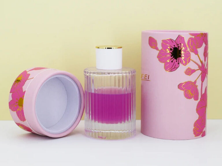
For example, a perfume tube with a protective insert combines the external visual presentation with internal product restraint. The appearance cannot be evaluated independently from the structure holding the bottle.
Digital vs. Offset Printing: Which Is Better for Custom Packaging?
Neither method is universally better.
Digital printing is generally valuable when artwork flexibility and job changeover matter. Offset printing remains highly useful when production is stable, volumes justify setup and conventional color-control requirements favor an analog press.
The exact economics must be quoted for the actual job.
Decision Factor
Digital Printing
Offset Printing
Frequent artwork changes
Strong fit
Additional setup may be required
Multiple low-volume SKUs
Strong fit
Can become inefficient when every SKU requires separate setup
Variable data
Major advantage
Normally handled through other workflows
Repeated large stable runs
Depends on press and job
Often economically attractive
Conventional spot-color workflows
Press-dependent
Well established
Complex photography
Strong
Strong
Substrate compatibility
Equipment-dependent
Broad, but still job-dependent
Finishing
Depends on print engine and converting line
Wide range through established post-press processes
Setup economics
Usually lower analog setup burden
Plates and makeready create fixed setup costs
There is no reliable universal digital-to-offset break-even quantity
Current packaging guides publish substantially different crossover quantities for the two processes. That variation is a useful warning: a generic number should not determine a purchasing decision.
Ask the supplier to calculate both options using the actual specification.
Cost depends on factors such as:
dimensions and sheet utilization
number of SKUs
quantity per SKU
printing coverage
substrate
spot colors
plate requirements
finishing
press setup
waste allowance
repeat-order expectations
The relevant question is not, “Which method is cheaper?”
It is:
“Which production route gives us the lowest cost for an approved, usable package while meeting our color, SKU and lead-time requirements?”
Digital printing is particularly useful for versioning
Modern industrial digital platforms can handle variable data and high job mixes, allowing content to change without creating a conventional printing plate for every version. HP’s industrial digital systems, for example, support variable data, multiple SKUs and automated production workflows.
That makes digital production useful for:
regional artwork
language versions
seasonal packaging
limited editions
retailer-specific designs
individualized QR codes
serial numbers
promotional campaigns
market-testing runs
This is where digital printing should be viewed as a supply-chain capability, not simply a graphic effect.
CMYK, Pantone and Brand-Color Control
Color problems often begin because different people are approving different references.
A designer may approve an RGB monitor image. Marketing may quote a hex value. The packaging factory may receive a CMYK conversion. A previous supplier may have printed a Pantone spot ink.
These are not automatically equivalent.
Adobe recommends CMYK when preparing artwork for process-color printing and notes that the colors achievable in CMYK depend on the printing conditions.
Pantone likewise distinguishes between spot colors and process colors. Pantone spot-color systems define individually formulated colors, while CMYK combines cyan, magenta, yellow and black to simulate a broader range of colors.
Do not assume every digital press is limited to basic CMYK
This is an area where generic packaging advice can become outdated.
Some industrial digital presses now use expanded color sets, specialty inks and sophisticated color-management systems. HP, for example, documents digital systems offering extended gamuts and spot-color capabilities.
Therefore, instead of asking:
“Can digital printing match Pantone?”
Ask:
“Which press will print my job, what ink set does it use, and how will you define and approve my brand-color target on this substrate?”
That produces a much more useful answer.
The substrate changes the result
The same ink can look different on:
coated white paper
uncoated paper
natural kraft
textured stock
metallic material
laminated surfaces
Pantone provides separate coated and uncoated references for precisely this reason: paper and surface condition affect the visual result.
If your brand color is commercially important, approve it on material representative of the production job rather than approving it only from a monitor.
A PDF Proof Is Not the Same as a Color Proof
One of the most useful distinctions in packaging procurement is between artwork approval and production approval.
A PDF or 3D soft proof is useful for checking:
spelling
logo placement
artwork orientation
SKU
dimensions shown on the proof
barcode number
finishing locations
legal text
panel hierarchy
It should not automatically be interpreted as a guarantee of exact printed color.
ISO 12647-7 covers controlled hard-copy digital proofing systems intended to simulate specified printing conditions. That distinction demonstrates why a calibrated hard-copy proof is fundamentally different from viewing an ordinary PDF on an office monitor.
For color-critical packaging, consider retaining:
approved artwork
defined color target
approved physical proof or production sample
signed-off finishing specification
retained sample from the accepted bulk run
The retained sample is particularly useful when discussing future reorders.
How Should Foil, Embossing and Spot UV Be Used With a Logo?
Finishing should reinforce the hierarchy of the brand rather than compensate for weak artwork.
Common choices include:
hot foil stamping
embossing
debossing
spot UV
matte or gloss lamination
specialty paper
textured surfaces
For production, special effects should normally be separated from ordinary CMYK artwork so the converter can identify exactly where the finishing operation belongs.
A useful artwork-layer system might contain separate layers for:
production dieline
CMYK artwork
Pantone spot colors
white ink
foil
emboss/deboss
spot UV
variable data
Do not assume that a decorative finish can be placed anywhere. Minimum line widths, registration tolerances and distance from cuts or folds depend on the converter’s equipment.
A foil-stamped tea tube packaging example illustrates this integration well: the packaging combines a foil-lined internal structure and tinplate closure with decorative hot-foil branding. The functional and visual specifications are part of the same package.
Prepare Packaging Artwork for Manufacturing, Not Just Presentation
A strong artwork file should allow the supplier’s prepress department to understand the design without guessing.
Before final submission, check the following.
Artwork
approved supplier dieline used at the correct scale
vector logo supplied
correct SKU and product name
images supplied at suitable production quality
fonts handled according to the printer’s requirements
CMYK and spot colors deliberately specified
bleed extended according to supplier instructions
critical text kept inside the supplier’s safe areas
artwork orientation checked after assembly
Finishing
foil defined separately
emboss or deboss defined separately
spot UV defined separately
white ink identified where required
special varnishes or coatings documented
Version Control
Name files so that nobody has to guess which one was approved.
For example, maintain a controlled system identifying:
product/SKU
artwork revision
market
language
approval status
Avoid production instructions based on filenames such as:
final-new-REAL-final2.ai
That may sound trivial, but version ambiguity becomes expensive when several SKUs, distributors and language versions are running simultaneously.
Pay Special Attention to Barcodes on Paper Tubes
Barcode artwork is not simply another black graphic.
GS1 advises checking barcode quiet zones, symbol dimensions, contrast, construction, deterioration and placement. Its guidance specifically notes that inadequate positioning can be a problem on cylindrical packaging.
For paper tubes:
do not place the barcode across the structural seam
avoid excessive curvature where scanning becomes unreliable
preserve the required clear area around the symbol
maintain adequate contrast
verify the finished printed barcode rather than only inspecting the artwork file
GS1 also recommends ISO-based barcode verification when print quality needs to be measured objectively.
For retail programs, barcode testing should be part of print QC rather than left until finished inventory reaches a warehouse or retailer.
Design Multi-SKU Packaging as a System
A single package can be treated as an isolated creative project.
A product range cannot.
For multi-SKU packaging, divide artwork into two categories:
Locked elements
master logo
logo position
typography system
structural dimensions
information hierarchy
barcode area
finishing zones
Variable elements
SKU name
color
flavor or scent
regional language
product photography
regulatory content
QR code
promotional information
Keeping structure stable while allowing controlled artwork variation can simplify sourcing and reduce unnecessary tooling changes.
This is one of the strongest applications for digital printing because the production workflow can accommodate more versioning without rebuilding conventional plates for each design.
Design International Packaging Around Compliance Space Early
International packaging should not be treated as an English package with translations squeezed into whatever space remains.
Before artwork is finalized, define:
countries of sale
required languages
barcode format
legal product information
ingredient or specification panels
warning areas
recycling or disposal information where applicable
importer/distributor information where required
Regulatory requirements depend on the product category and market, so the responsible regulatory team should confirm the final content.
From a design perspective, the important principle is simple: reserve compliance space before the artwork becomes visually locked.
Otherwise, adding required information late can destroy hierarchy and trigger another approval cycle.
Build Proofing and QC Into the Design Process
The most effective QC process begins before mass production.
A practical workflow is:
1. Structural review
Confirm the package dimensions, product fit, insert, lid, opening action and shipment requirements.
2. Prepress review
Check dieline scale, artwork orientation, color separations, fonts, images, bleed, barcode and finishing layers.
3. Artwork proof
Approve text, layout, SKU information and finishing positions.
4. Physical sample
Use a representative prototype when structure, material, color or finishing needs physical evaluation.
5. Production reference
Once the approved result is reached, define what will be used as the standard for bulk QC.
6. Repeat-order control
Compare future runs against retained artwork, specifications and physical references rather than relying on memory or monitor images.
For teams moving from development into regular purchasing, a custom paper tube manufacturing program should connect material selection, printing, finishing, structural details, sampling and production rather than treating each step independently.
What Should You Send a Packaging Supplier for an Accurate Quote?
The quality of the RFQ affects the quality of the quotation.
Instead of asking only for a price for a “custom printed tube,” send:
product dimensions
product weight
packaging dimensions if already established
required quantity by SKU
number of artwork versions
destination market
target material or appearance
logo/artwork files
print requirements
Pantone or other critical color references
required finishes
insert requirements
closure requirements
barcode requirements
expected reorder pattern
target delivery location and timing
This allows the supplier to identify whether the job should use a standard structure, custom tooling, digital production, offset production or another converting route.
It also makes competing supplier quotations easier to compare because each factory is responding to essentially the same specification.
Common Custom Packaging Design Mistakes
Mistake
What Goes Wrong
Better Approach
Designing before obtaining the production dieline
Artwork needs to be repositioned or rebuilt
Lock structure first
Supplying only a web-resolution logo
Edges can appear poor or prepress must recreate artwork
Supply vector master files
Approving color from a monitor
Printed substrate does not match expectations
Define physical or measurable color target
Choosing digital solely because MOQ is low
Color, substrate or finishing may not suit the job
Compare total job requirements
Choosing offset solely because volume is high
Multiple versions may create unnecessary setup complexity
Evaluate quantity per artwork version
Treating the proof as only a formality
Errors reach bulk production
Use a formal approval checklist
Adding languages late
Layout becomes crowded
Reserve multilingual/compliance zones early
Placing barcode without cylindrical testing
Scanning can become unreliable
Verify the finished printed package
Overusing foil, UV and embossing
Visual hierarchy becomes confused and cost rises
Choose finishes according to brand hierarchy
The Best Packaging Design Is the One You Can Reproduce
A striking rendering is useful during concept development, but repeatable manufacturing is the real test of custom packaging design.
The highest-value design decisions usually happen at the intersection of branding and production:
Is the logo positioned correctly after assembly?
Can the chosen process reproduce the brand color?
Does the substrate change the color or finish?
Will several SKUs share one structure?
Is digital versioning operationally useful?
Are the dieline and finishing layers controlled?
Has the barcode been tested on the actual package?
What proof or physical sample defines acceptance?
Can the same specification be reordered six months later without restarting the discussion?
Solve those questions before mass production and custom packaging becomes easier to source, inspect and scale.
Frequently Asked Questions
What file format should I use for a packaging logo?
Use a vector version of the logo whenever possible, such as production artwork created in Illustrator or another vector-design system. Vector artwork allows the printer to scale the logo cleanly and separate elements for CMYK, spot colors, foil or embossing without depending on a low-resolution raster image.
A JPEG may be useful as a visual reference, but it should not automatically be treated as production master artwork.
Do I need the packaging dieline before my designer starts?
Yes, once the packaging structure has been selected. Early concept sketches can be created beforehand, but final production artwork should be built on the approved manufacturer’s dieline.
Using a generic template risks panel-position, fold, glue-area, trim and dimension discrepancies when the actual packaging is manufactured.
Is digital printing better than offset printing for custom packaging?
Not universally. Digital printing is particularly useful for versioning, short or changing jobs, variable data and multi-SKU programs. Offset can be advantageous for stable production runs, conventional spot-color workflows and many high-volume applications.
Ask the supplier to quote both production routes against the same specification rather than relying on a universal quantity threshold.
Should packaging artwork use CMYK or Pantone colors?
Use the system appropriate to your printing process and color expectations. CMYK is used for four-color process printing, while Pantone references are often used when a specific brand-color target needs to be communicated.
The final result also depends on substrate, coating, ink system and press capability, so color should be approved using an appropriate physical reference when it is commercially critical.
Can one packaging design be used across several SKUs?
Yes, and designing the range as a system can reduce unnecessary complexity. Keep structural dimensions, logo hierarchy, typography and key production zones consistent while allowing SKU-specific elements such as product names, colors, languages or QR codes to change.
Digital printing can be particularly useful when the number of artwork versions is high relative to the quantity of each version.
How can I prevent packaging colors from changing between orders?
Define the color target before the first production run, identify the substrate and finishing system, retain approved artwork and keep a physical production reference where practical.
For reorders, ask the printer to match the approved specification rather than relying only on the same CMYK numbers or the appearance of the artwork on a monitor.